Disconnections by Minute Chart
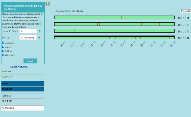
IntraVUE shows disconnections in the event log but it is impossible to find which devices disconnected at the same time. This chart solves that problem.

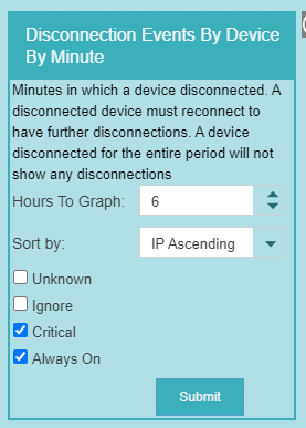
There is a control to enter the number of Hours To Graph. For each minute that a device had a disconnection event, there will be a red line.


The check boxes of Critical States will show only devices having those states, making it easy to see just critical devices.
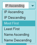
The data can be sorted according to the option selected in the Sort By drop down control.
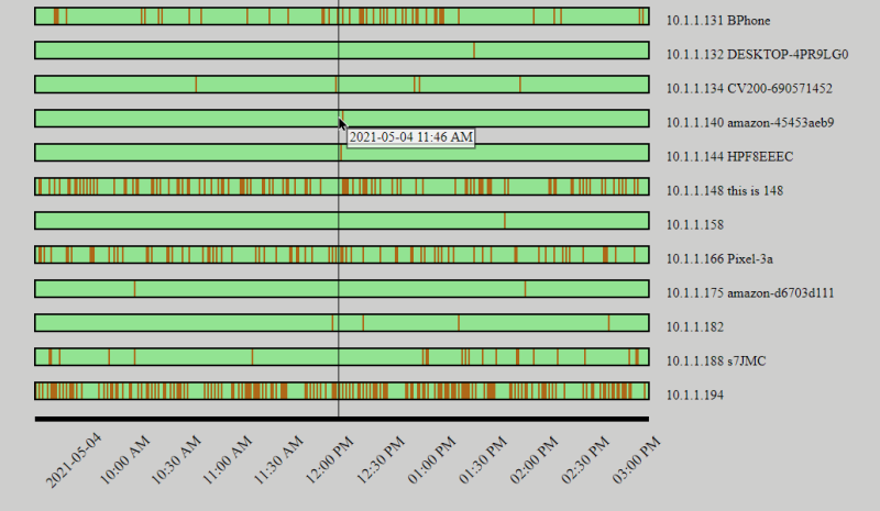
In order to have multiple disconnects (vertical red lines) a device must reconnect each time. Seeing many lines for a device indicates the device is having serious issues maintaining a connection. Devices connected by Wi-FI may have this issue but if they are critical and having disconnections some changes may be required.
As the mouse moves in the graph, a vertical line shows the time of the disconnections.
A svg export icon allows you to save the graph for printing.

